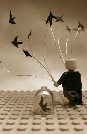
7 Real World album covers re-created with Lego
Two 11 year olds combined their favourite things —Lego and world music— in this wonderful rainy...
Thu, 05 April 18
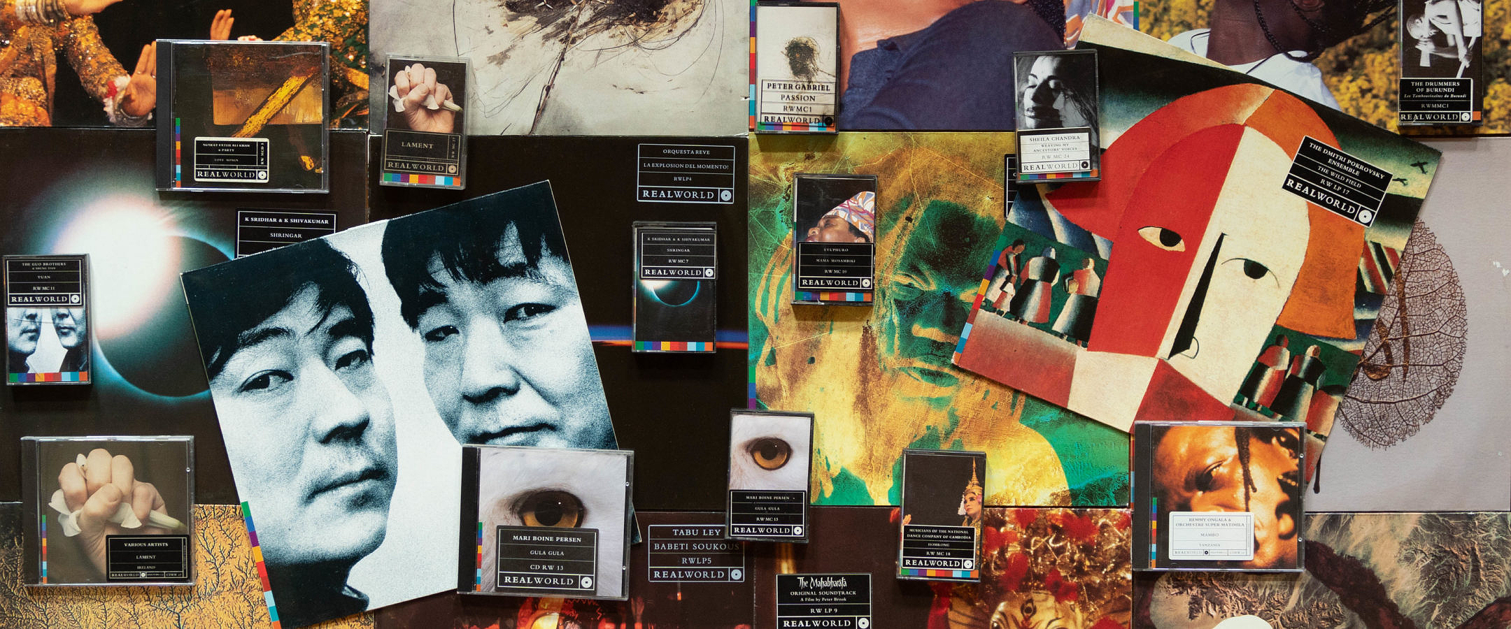
The visual identity of Real World Records has made its catalogue of releases unmistakable on record store shelves for over two decades. In this feature the designers who created the iconic Real World colour bar and visual concept, Malcolm Garrett and Garry Mouat, recall their experiences in working with Peter Gabriel to develop the label's 'look' back in 1989.
Malcolm: That’s two questions. The introduction came about because Assorted Images (our design studio) handled a lot of the design work for Virgin Records’ major signings, and so we worked with Simple Minds, Culture Club, Heaven 17, The Human League— many of the important signings on the label. So when Simon Draper was speaking to Peter Gabriel about the Real World label, I was naturally a designer who already worked with Virgin and had a studio which had the right level of design credentials and could handle the design for a major label signing like this, rather than just an artist signing.
Garry and I both recall going to meet Peter in the hotel in Selfridges, where he outlined his vision for the Real World label. We were both familiar with the WOMAD festival— they’d done a great double album of acts who’d played at the WOMAD festival which had been released a few years beforehand. My memory is that the notion for a Real World label grew out of the success of that.
Peter himself had a very strong vision for the direction that the Real World label should take, and had a vision for how the studio in Box could be central to being able to record musicians with state-of-the art equipment, but also would preserve all of the ethnicity and the root-level feel of the music. Peter wanted to be able to put the music onto a world stage, but at the same time not compromise what it was that he himself appreciated and loved in that music. So, that informed the brief for what Garry was able to come up with to build a graphic framework which represented that.
MAILING LIST
Embark on a voyage of musical discovery with us by signing up to the Real World newsletters
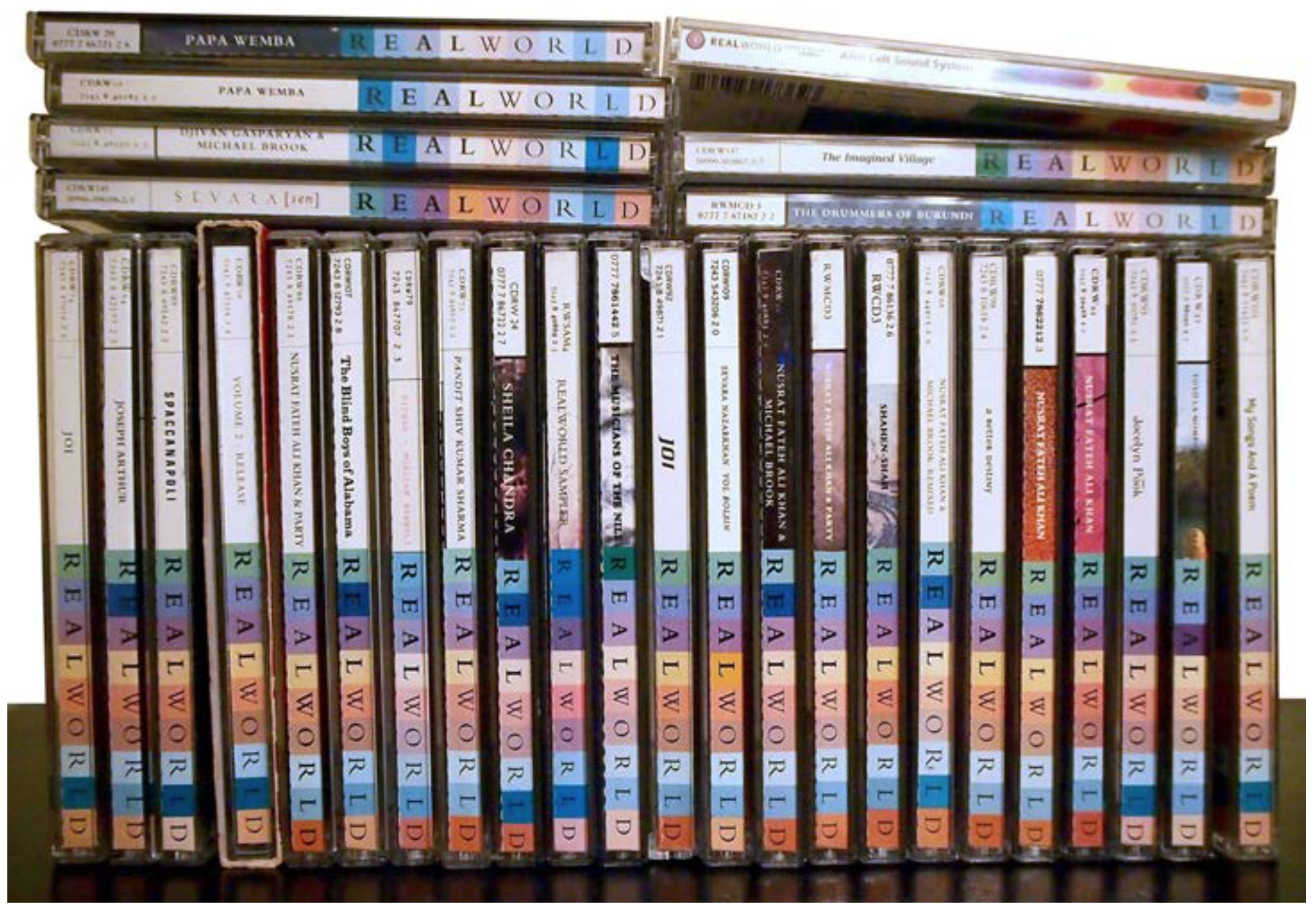
Malcolm: That’s something that Garry and I talked about last week; the nature of its longevity. It was something that together we spent a lot of time considering and thinking about. The fact that we were able to create something that has lasted this long was part of the brief we gave ourselves. We wanted something with that kind of resilience and longevity from the outset. And it’s great that it still does work. Fantastic. And it did represent the nature of the recordings and how Peter himself was curating that collection of recordings. That’s one of the reasons for its success— it wasn’t just a painted little stripe that looked attractive. It inherently embodied the nature and the ideals of the whole label. When you’re developing an identity, the word identity is crucial to it. Identity means that it must represent everything that that label is about. It’s not just something that you stick on top and hope that it’s some kind of marker. It’s much more implicit than that.
Garry: Up until that point there’d been a lot of interest in world music, but there was criticism of the way the production of some releases wasn’t up to scratch, and also of how the design ethic wasn’t up to scratch. I remember that Peter wanted to highlight the contrast of hi-tech/low-tech, ancient and modern, and in some ways the mill wheel which became the mark of Real World and Box was meant to reflect that. The mill wheel is a circular stone, but with a square inside. The square inside, for me, symbolized the modern, digital age inside a circle which symbolizes the world, the sun, the moon, etc. So, that kind of ancient and modern, macro and micro…
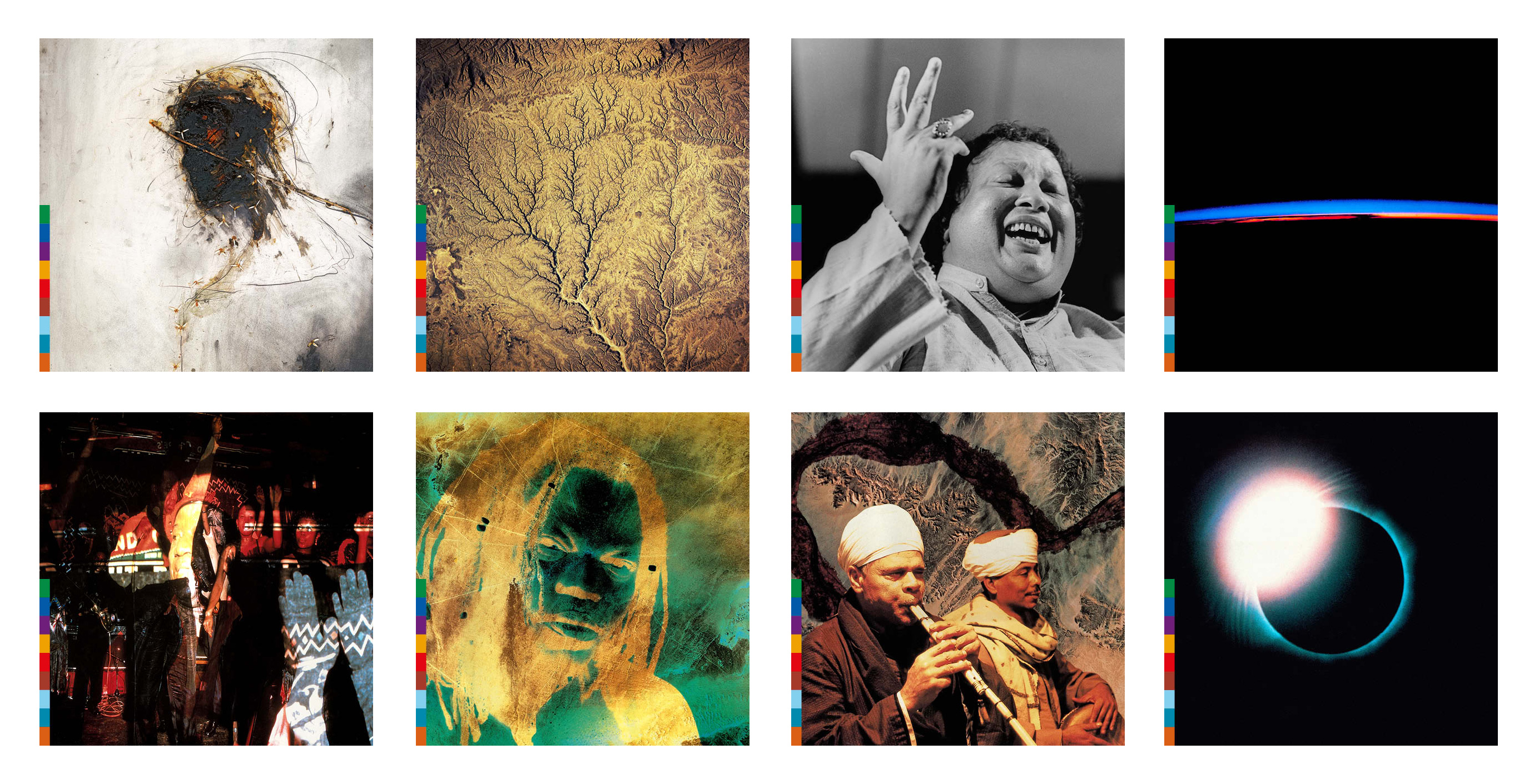
Garry: We had a book in the studio called The Home Planet by Kevin W. Kelley. It was a collaboration between the Soviet agency and NASA, and published mainly pictures. We were hoping/planning to use those images and then it turned out that Peter had an astronaut friend, so Rusty helped us greatly to get hold of high-res images of those that we wanted to use. What might have appeared to be problems and issues on the design were all kind of worked out on Peter’s music for The Last Temptation of Christ, Passion and Passion Sources. The next design we looked at after that was Shahen Shah by Nusrat Fateh Ali Khan with an amazing photograph by Dave Peabody. In some ways, my recollection of this whole process was that it went along quite smoothly, I know that I spent a lot of time to-ing and fro-ing on the colour coding, and consulting with Malcolm on that, as Malcolm is my most trusted design partner; so, if he don’t know, no-one knows.
7 Real World album covers re-created with Lego
Two 11 year olds combined their favourite things —Lego and world music— in this wonderful rainy...
Thu, 05 April 18
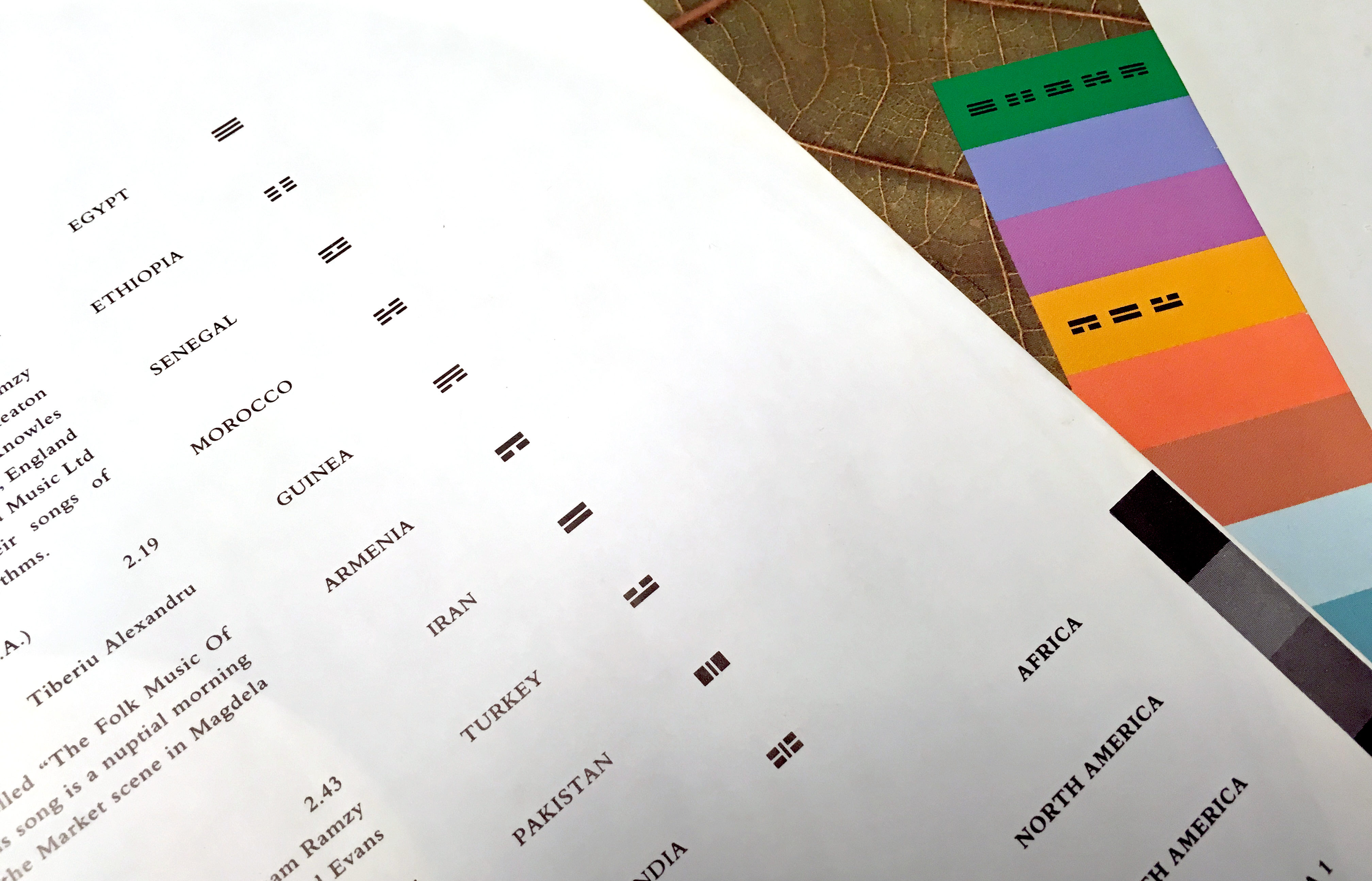
Malcolm: I recall that Peter was debating what names to use for the regions, because the colours represented the different parts of the world, and it wasn’t as simple as the old five continents. It was quite a delight that there were nine regions decided upon, since this corresponded to the nine letters in ‘Real World’.
We were looking to ensure that whatever we presented as a graphic framework had a flexibility which allowed the individuality of the music —wherever it came from in the world, and however it was generated— not to be compromised by an over-arching system with too much discipline.
Garry: When the Real World project first came along I’d just spent six months in India. The photo of a leaf on the back of Passion Sources is a leaf that I ate my dinner off in India. And of course on that release, because we had five different countries within Africa, we had to come up with this kind of sub-code. We used little symbols. They were originally based on the I Ching symbols, but we felt we needed to adapt them beyond that.
Malcolm: Peter’s guidance was extremely helpful, because it was his view that we should be creating a framework that allowed for full bleed imagery that would work without lettering on top of it, so that the spirit and the feeling of the music could be conveyed by a visual means without the distraction of text.
Garry: Peter had a phrase —I think it was something like ‘uninterrupted continuous image’— which was what he wanted to see. How would somebody come to this design, this piece of artwork, without having words attached to it? The removable sticker idea, by the marketeers, was quite thoughtful. For some releases, the type was black on a semi transparent sticker, other times it was a black sticker, depending on what the background image was like— how complex it was.
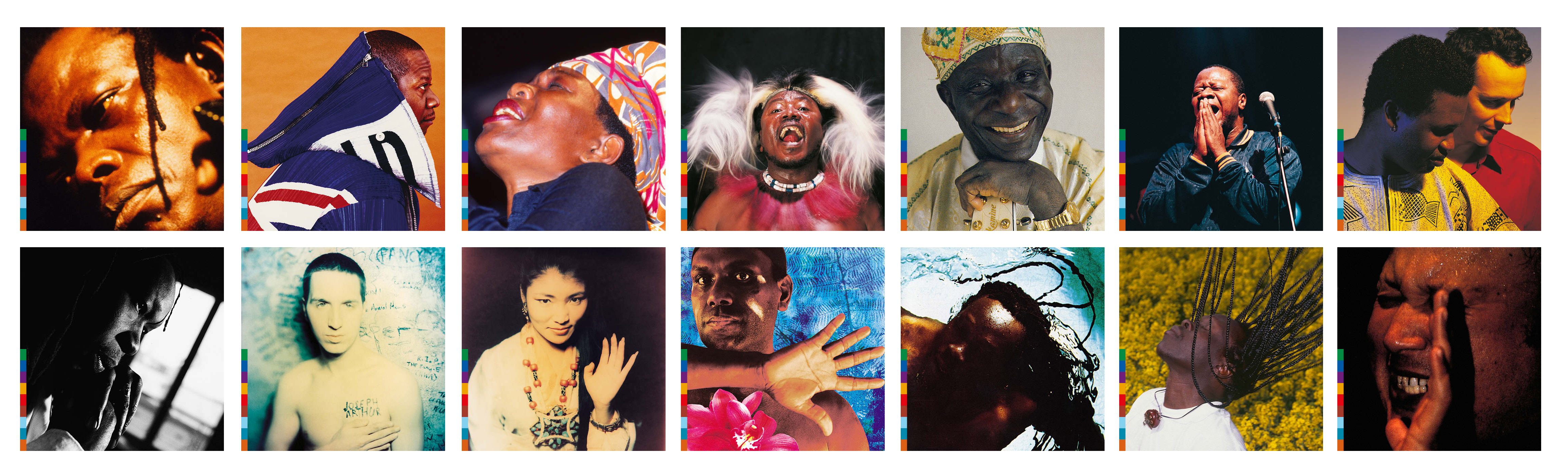
We wanted to present a sense of consistency, without seeking to be overtly prescriptive or compromised. The process of choosing imagery was individual and unique to each artist so as to retain their own sense of identity. Garry Mouat, Assorted Images
Malcolm: In that regard we looked at some of the best practice from the world of classical music where you have a similar, but different requirement. We looked at the likes of Deutsche Gramophone, and there were similarities, but also great differences. With Deutsche Gramophone releases, the people are familiar with Tchaikovsky, they’re familiar with Beethoven, but they want to know that this particular recording of Romeo and Juliet or that particular recording of Beethoven’s 9th is of a sufficient quality. So in those cases they would see the Deutsche Gramophone logo and go ‘Oh yes, this has the quality I want’. Here it was a similar kind of requirement— to express that kind of quality, but also to encourage people to buy into or explore something they’d never encountered before. It wasn’t like looking for quality in something you’re familiar with and wanting the best version of that, it was for people wanting to explore something new.
Malcolm: The whole Real World raison d’être was to bring contemporary and state-of-the art recording techniques to a more analogue or earthbound world of music. We were at the cusp of the whole of the music industry, and the design industry, as it would later transpire, moving from an analogue world into a digital world. So whilst the initial releases were all on vinyl and cassette, the industry was moving into the digital era, and Assorted Images was making a similar transition in terms of the production tools we were using.
At the beginning of the Real World process all of the artwork was made analogue on conventional large format pieces of art board, but we had invested early in computer technologies to look at the future of design and production of design. The programme of work for Real World allowed us to set up a range of digital templates. The nature of how we were designing the whole sleeve environment for the label was a perfect opportunity to use digital templates, and this was the first project of its kind that we’d done, and certainly the first that Virgin, through Real World, had engaged in. We were looking at the means of production in quite a forward-thinking way.
The digital template enabled Real World to build its own in-house Art department under Martha Ladly, which then eventually picked up the production for all of the sleeves as well as for publishing The Box magazine.
Garry: I recall personally putting together the first eight releases, and then, as Malcolm mentioned, the digital template was put together by a lady called Helen Jones. I think Assorted Images worked right up to at least RW30. Apart from the initial eight, all the others were put together in that new digital template system.
Malcolm: We hold the Real World project in very high regard. It’s certainly at the pinnacle of our achievements and will stand the test of time and we’re proud of that and hopefully for all the right reasons.
Garry: For me it’s the modern classic; it’s gone the distance and may well continue…
Featured Release
Various Artists
Released 28 September 2014
Embark on a voyage of musical discovery with us by signing up to the Real World newsletters
Two 11 year olds combined their favourite things —Lego and world music— in this wonderful rainy day project.
Thu, 05 April 18
The legendary recording engineer/producer worked on projects at Real World Studios for Peter Gabriel...
Thu, 08 May 14
Looking back on the first ten years of the WOMAD organisation.
Sun, 21 June 92